
Ron Hanner Biography
 Ron Hanner (1934 - ) Ron was born in River Rouge, Michigan. Grew up in Berkley, Michigan until moving to California in 1960. All of Hanner's painting were painted quickly, with a large brush, on site‚ usually along the Mendocino coast. They are semi-abstract, and some have said are in the California Style.
EDUCATION
Bachelor of Fine Arts degree, Wayne State University, Detroit, Michigan, 1958, where he attended full time for 5¬Ω years and majored in Industrial Design. Ron has since practiced industrial design, graphics design, package and product display design, retail store interior design, and has been an art director at several firms. He has studied with dozens of nationally known watercolor instructors. Ron also has earned a California real estate broker's license and has been practicing for the past 9 years.
Ron has TAUGHT Watercolor at the Mendocino Art Center. He gave a watercolor demonstration for the Delta Watercolor Society in Stocton. He has organized and taught life drawing at the Los Gatos-Saratoga Department of Recreation.
Ron has STUDIED with the following watercolor painters during the past 40 years:
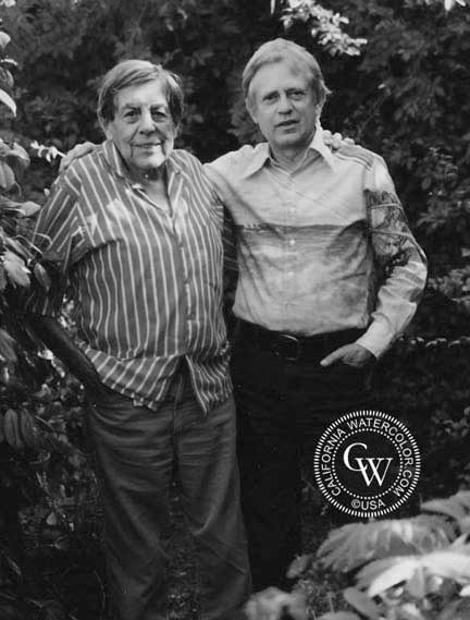
George Post (for 20 years, and Ron considered him his mentor).
Christopher Schink, Millard Sheets, Frank Webb, Pat Deadman, Vernon Nye, Rollin Pickford, Edward Norton Ward, Jade Fon, Richard Yip, Wil Provan, Don O’Neil, Jane Burnham, Dan Peterson, Bud Shackleford, Tony Cristallo, Tony VanHasselt, Judy Wagner, Carolyn Lord, Judith Hale, Frank Francese, N’ima Leveton, Warren Zimmer, Barbara Lubke, Morris Shubin, Nancy Livesay, James Soares, Ted Maddock, Bob Newick, Dan Murphy, Robert Burridge, Phil Livingston and Kevin Milligan.
He has EXHIBITED at:
The Detroit Institute of Arts, Detroit
Fireside Gallery, Carmel
Valley Art Center, Portola Valley
Mendocino Art Center, Ron Hanner Retrospective Nov. 2004
Mendocino Art Center member's show
Gallery 9, Los Altos
Portrero Hill Art Gallery, San Francisco
Masters Gallery, Calistoga
Fort Bragg Center for the Arts
Peggy Errikson Gallery, Half Moon Bay
Ritz Carlton resort, Half Moon Bay
Bay Window Gallery, Mendocino
Betty Graubard Gallery, Fort Bragg
Wilkes Bashford Gallery, Mendocino
Coastside Gallery, Mendocino
Old Town Art Center, Los Gatos
California View Gallery, Los Gatos
Horse's Mouth Gallery, Saratoga
Saratoga Trunk Gallery, Saratoga
Gallerie, Los Gatos
Paint Brush Gallery, Saratoga
Saratoga Rotary Art Fair
Rosicrusian Museum, San Jose
Los Gatos Art Association
Santa Cruz Art League
Palo Alto Medical Center
Art at Valley Fair, San Jose
Lockheed Employee’s Rec. Center, Sunnyvale
West Valley College, Saratoga
Santa Clara County Fair, San Jose
Wells Fargo Bank, Los Gatos
Imperial Savings, Saratoga
Bank of the West, Los Gatos
Bank of America, Saratoga
Paul Bunion Days Fair, Fort Bragg
Mendocino Art Center Art Fair
Palm Desert Community Library
Ron has been a MEMBER of and exhibited with the:
Coachella Valley Watercolor Society
Santa Clara Valley Watercolor Society
San Jose Art League
Los Gatos Art Association
East Valley Artists, San Jose
Santa Cruz Art League
Acknowledgements and AWARDS:
Artist of the Month, first place ribbon award, Coachella Valley Watercolor Society
Curator and office manager for the Fort Bragg Center for the Arts
Coordinator of the Kaliedescope Art Fair, Fort Bragg
Solo exhibit at Mendocino Art Center, Mendocino
Solo exhibit at Gallery 9, Los Altos
Solo exhibit at Bill Zaka's Bay Window Gallery, Mendocino
Solo exhibit at Betty Graubard Gallery, Fort Bragg
Solo exhibit at the Fort Bragg Center for the Arts
Finalist 4 times at the Jade Fon Asilomar watercolor workshops
Award of merit from the Santa Clara Valley Watercolor Society
Large ribbon award from the Los Gatos Art Association
Ribbon award 3 times from the East Valley Artists
Ribbon awards from the Los Gatos Art Association
Ron Hanner's paintings are in numerous collections throughout the United States.
Biographical information:
Interview with Ron Hanner, 2011
California Watercolor
A Good way to Paint a Watercolor by Ron Hanner
Granted‚ it really does take a lot of courage to make a painting. I have heard non-painters say it must be relaxing while painting a watercolor. No, actually it is very intense. There are a dozen important and necessary decisions constantly being made in the artist's mind.
It's not about painting reality. That's sometimes called an illustration. A PAINTING is about creating composition, interesting shapes, and value and color relationships, as I will keep saying. A painting is where you eliminate a lot of things, move things around for composition. It's quite a challenge, but it is very rewarding when eventually you get it. Practice, or mileage as we call it, is the key. And no one has said it is easy. But don't let me discourage you. Go at it anyway.
Perfection by copying nature is not the goal here. Leave perfection to illustrators, or painters of a different style. As a watercolor painter, you should focus on concept, composition and values as items to master. It's also about spontaneity and freshness. You will probably soon develop your own individual style. It's like handwriting; everyone has his own unique style. And not enough in a painting is better than too much. Let the viewer finish it in his own mind. Believe me, that does work. Many artists have said it takes 2 to make a painting‚ one to paint the painting, and one to take away his brushes before he ruins it.
Many of my suggestions here are somewhat general, and many are individual to my style. The majority are like those of George Post, whom I studied with for 18 years. But use your own methods that express yourself best.
It's better to start the right way from the beginning.
So, to start with, the following is a hierarchy of the most important things to keep in mind when at a painting site.
1. Get an inspired concept. Choose only a setting or site that excites you enough to want to paint it‚ and then simplify. Select only the things in the scene that will contribute to the composition. Leave out a lot‚ or maybe half of it, or even more. Don't paint exactly what's there. Nature will want you to put in everything‚ but use restraint. It is very strong‚ resist it.
2. Make a very rough sketch (not a careful drawing) to indicate how the shapes that you select will create a good composition. Leave out all detail for now. A little detail can come later.
3. On this sketch, also indicate the very dark and middle tone objects, shapes, and the plain area shapes, as well as to carefully not paint the white shapes. These are called VALUE and SHAPE relationships, as opposed to color relationships.
4. Carefully decide exactly where you want your white areas and other major shapes to be. You can't get whites later after painting on the paper. This is VERY important. Even the shapes of the white areas are important.
5. Improve on, and convert shapes that you see on your sketch‚ to make even more interesting shapes as you paint.
6. Quickly put in a very few soft pencil lines to divide up the watercolor sheet after looking at your value sketch. Don't draw the whole thing in. That would be like painting in a coloring book. I mean, only 5 or 6 lines to divide the areas. It doesn't matter much if what you pencil in is exactly correct. DON't DRAW what you want‚ PAINT what you want. Granted that is not easy. But try it. What is also important is the composition and values that you paint. Again, forget the temptation to paint exactly what you are looking at. Create what you want‚Ķas shapes from your concept, for the sake of the painting. Nature is not to be painted. Think only of your concept.
7. Use a 1 Aquarelle flat brush until you want to invest more money in larger sizes. Mix up the color you want to apply first, and paint the farthest away part first. That is usually the sky. Paint with water first, then color immediately after to help make a uniform paint coverage.
You can do a lot with a 1 brush. Use it to make a sharp, chisel line, or tilt it in different ways using just the tip, or run it as a 1 flat ribbony strip. The only time to use a small, round brush is for signing your name. An exception is a medium size pointed round, very long hairbrush is good for calligraphy.
2. For a landscape painting, paint in the sky color at the top of your paper. Try to go all the way across the top with a fully loaded single brush stroke‚ (for me, that would be with a large, flat 2 or 3 inch brush). The second stroke down should be with water. That will give what's called a graded wash. The blue from above will come down and mix with the clear water to make it a lighter blue. Notice in nature, the sky is darker higher up.
3. Then, give the sky time to dry (bone dry), and then you can paint darker objects like mountains, trees, etc. over the top of parts of the sky. (Many amateurs will sometimes paint in the trees and buildings first‚ then paint around them later with the blue of the sky. That will look patchy). Trees and mountains are darker than the blue sky, so that works out well, so you can successfully paint over parts of the sky.) But if it is not dry, your new strokes will bleed. (Your attempts to sponge off that mistake will usually pretty much ruin the painting)
4. After this, you can go to lower areas and paint from mid-distant to closer. Any time you put paint in an area with a different color, you must let it become bone dry before applying subsequent paint…unless you want to have that happen. And that sometimes can look very attractive. Paint next in a different part of the painting that is dry while that other area is drying.
5. For learning purposes, the least important consideration is color, compared to the other items listed above. Color is of personal choice and is developed with practice, and of course with education. In some cases you might want to change the colors in nature to suit the painting, and to add a personal touch. (Try light blue tree trunks to separate it from the green vegetation and the tree foliage color above).
6. One thing that just about ALL beginners do, or I should say not do‚ is to not learn to mix colors to achieve dark VALUES. There has to be light and dark values of the colors in the painting. Teachers often harp on that to beginners, and many students often don't get it for a year or so. There are no dark or light shades in paint tubes. It gets a little complicated, but to make it a darker color, use the compliment (color across from it on the color wheel) of that color with 2 of the following colors: Thalo blue, Thalo green, or Alizarin Crimson. Combining 3 three of these make black. That gives a more rich and attractive black than black from the tube. To make a color lighter, mix more water with it in the pallet. A good mixture that gives a very attractive color for shadows is purple and green. It makes a convincing somewhat purple-gray mixture color. Better than blue. And again when painting a shadow, be sure to flow on and cover the entire shadow as one shape to make it convincing. Daubing in later either while still wet, or dry, will ruin it. Once down‚ leave it alone. Resist that temptation, even if the shape isn't perfect‚ No daubing, no correcting. No exceptions‚ or it will fail.
7. To subdue a painted color that is too bright, paint over it with a very thin color glaze of it's compliment (opposite side of the color wheel). Another way is to carefully hold the area carefully under the kitchen sink faucet flow.
8. By the way, get a set of tube paints for a fresh, luscious result, do not use those dry pan sets. They make it much to get a fresh result. Just about all of your art needs are available from any good art supply store. Not from Michaels or other craft stores. I like Cheap Joe'sin Charlotte.
9. To start with, get a 1flat Aquarelle brush with a chisel ended handle. The chisel end is used to scratch in lines in painted wet areas for tree limbs, wires, don't bother with small brushes. Only put in large shapes with a large brush. Don't diddle with the small stuff. Leave them out. You want to keep the painting simple with large shapes. Too much detail makes the painting busy, amateurish, overworked, and tiresome. When it looks like the artist tried too hard, it is tiresome to look at.
Anything smaller than the 1 flat brush strokes shouldn't even be used in the painting, or be in the paint box. Small shapes detract from a monumental quality of the painting‚ LESS IS MORE as the artist Christoper Schink would say. He was twice as good as the best of any of my other 31 instructors that I have studied with. He taught advanced color and design. And he taught things we didn't already know.
Strive not to be considered a little old lady or a little old man painter. You will sometimes see them work on small sized paper, Notice they grab their brush up close and tightly to the ferrule like a pencil. And even notice them daub. That's disgusting. Daubing is not allowed. Make single (hopefully large) brush strokes of a ribbony nature that cover fairly large shapes and areas. Try to make each brush stroke a good shape. Sit back from the painting and extend your brush holding it in the middle or end of it and reach for a better rhythm with your large brush strokes. Wiggly, not perfect strokes from your brush are often better than straight lines. Try to develop calligraphic brush strokes. Try twisting and twirling‚ push and pull of your brush when painting. A round very long hair brush is best for this. Calligraphy will noticeably add life and freshness to your painting. Look at Japanese Sumi paintings techniques for inspiration.
Here's an idea: If you paint a small sheet of w.c. paper with a 1 brush, and then it makes sense if you use a 2 brush for a medium size paper‚ and a 3 brush for a full sheet size. That way you use the same number of brush strokes on the large sheet as a small one. A large painting is done that way in the same amount of time. My paintings take 1 hour‚ regardless of size.
A watercolor block of 20 sheets is quite convenient. They come in many sizes and textures. With it, you don't have to mount or stretch the paper beforehand, or carry a separate board to mount it on. But for individual sheets, you can use 4 bent wire clips, available at stationary stores. I see no need to staple the paper to the board. (There is so much effort invested in that process…it can be intimidating and hinder the first strokes of your painting. It's like you don't want to ruin the time invested by ruining the paper).
Find a water carrying container, and also a smaller one to dip your brushes in.
A white butcher tray or a white kitchen pan can work for a palette. Or better yet, get one designed as a watercolor pallet. That would be much better. I like the Robert E. Wood one because it has 4 large tubs on the top tray for pre-mixing large amounts, so you won't be running out of paint for large coverage areas (it comes as 2 trays, the top tray is also a cover to help protect the paint in the lower tray).
A small elephant ear sponge is invaluable to soak up accidental dribbles on the painting, and other important uses like lifting areas as needed. They have them at most art supply stores.
(about a 2 or so size.)
A hat to keep the sun out of your eyes.
A lightweight folding picnic chair.
You will develop your own equipment. You will want to lay your paper almost flat on any portable table, and tilt it up about an inch at the top‚ not tilted all the way up as with oil painting
Anything smaller than the 1 flat brush strokes shouldn't even be used in the painting, or be in the paint box. Small shapes detract from a monumental quality of the painting‚ LESS IS MORE as the artist Christoper Schink would say. He was twice as good as the best of any of my other 31 instructors that I have studied with. He taught advanced color and design. And he taught things we didn't already know.
Strive not to be considered a little old lady or a little old man painter. You will sometimes see them work on small sized paper, Notice they grab their brush up close and tightly to the ferrule like a pencil. And even notice them daub. That's disgusting. Daubing is not allowed. Make single (hopefully large) brush strokes of a ribbony nature that cover fairly large shapes and areas. Try to make each brush stroke a good shape. Sit back from the painting and extend your brush holding it in the middle or end of it‚ and reach for a better rhythm with your large brush strokes. Wiggly, not perfect strokes from your brush are often better than straight lines. Try to develop calligraphic brush strokes. Try twisting and twirling‚ push and pull of your brush when painting. A round very long hair brush is best for this. Calligraphy will noticeably add life and freshness to your painting. Look at Japanese Sumi paintings techniques for inspiration.
Here's an idea: If you paint a small sheet of w.c. paper with a 1 brush, and then it makes sense if you use a 2 brush for a medium size paper‚ and a 3 brush for a full sheet size. That way you use the same number of brush strokes on the large sheet as a small one. A large painting is done that way in the same amount of time. My paintings take 1 hour‚ regardless of size.
A watercolor block of 20 sheets is quite convenient. They come in many sizes and textures. With it, you don't have to mount or stretch the paper beforehand, or carry a separate board to mount it on. But for individual sheets, you can use 4 bent wire clips, available at stationary stores. I see no need to staple the paper to the board. (There is so much effort invested in that process‚ it can be intimidating and hinder the first strokes of your painting. It's like you don't want to ruin the time invested by ruining the paper).
Find a water carrying container, and also a smaller one to dip your brushes in.
A white butcher tray or a white kitchen pan can work for a palette. Or better yet, get one designed as a watercolor pallet. That would be much better. I like the Robert E. Wood one because it has 4 large tubs on the top tray for pre-mixing large amounts, so you won't be running out of paint for large coverage areas (it comes as 2 trays, the top tray is also a cover to help protect the paint in the lower tray).
A small elephant ear sponge is invaluable…to soak up accidental dribbles on the painting, and other important uses like lifting areas as needed. They have them at most art supply stores.
(about a 2 or so size.)
A hat to keep the sun out of your eyes.
A lightweight folding picnic chair.
You will develop your own equipment. You will want to lay your paper almost flat on any portable table, and tilt it up about an inch at the top‚ not tilted all the way up as with oil painting
I use a TV dinner table on each side of my easel. One for my pallet and water/brush container‚ the other side for my paint box and brushes.
After you do more painting, you can choose from a selection of watercolor easels from the Cheap Joe's store in Charlotte. I get most of my materials from them. They have one of the lowest prices in the U.S. You will get what you order by UPS‚ at your door in about 3 days. They will gladly send you a complete, professional catalog at no charge. Their phone # is:
1-800-227-2788.
Quote from George Post-what you see with your eyes closed is what you paint.
In my first workshop as a student with him‚ he had us face a scene, then we turned around and painted it from memory. An occasional peek was OK.
(That was a great way to outsmart that ubiquitous tyranny of nature).
Quote from Picasso-I tried my whole life to paint like a child.
He meant children paint concepts‚ as opposed to painting realism.
Happy painting! Ron Hanner